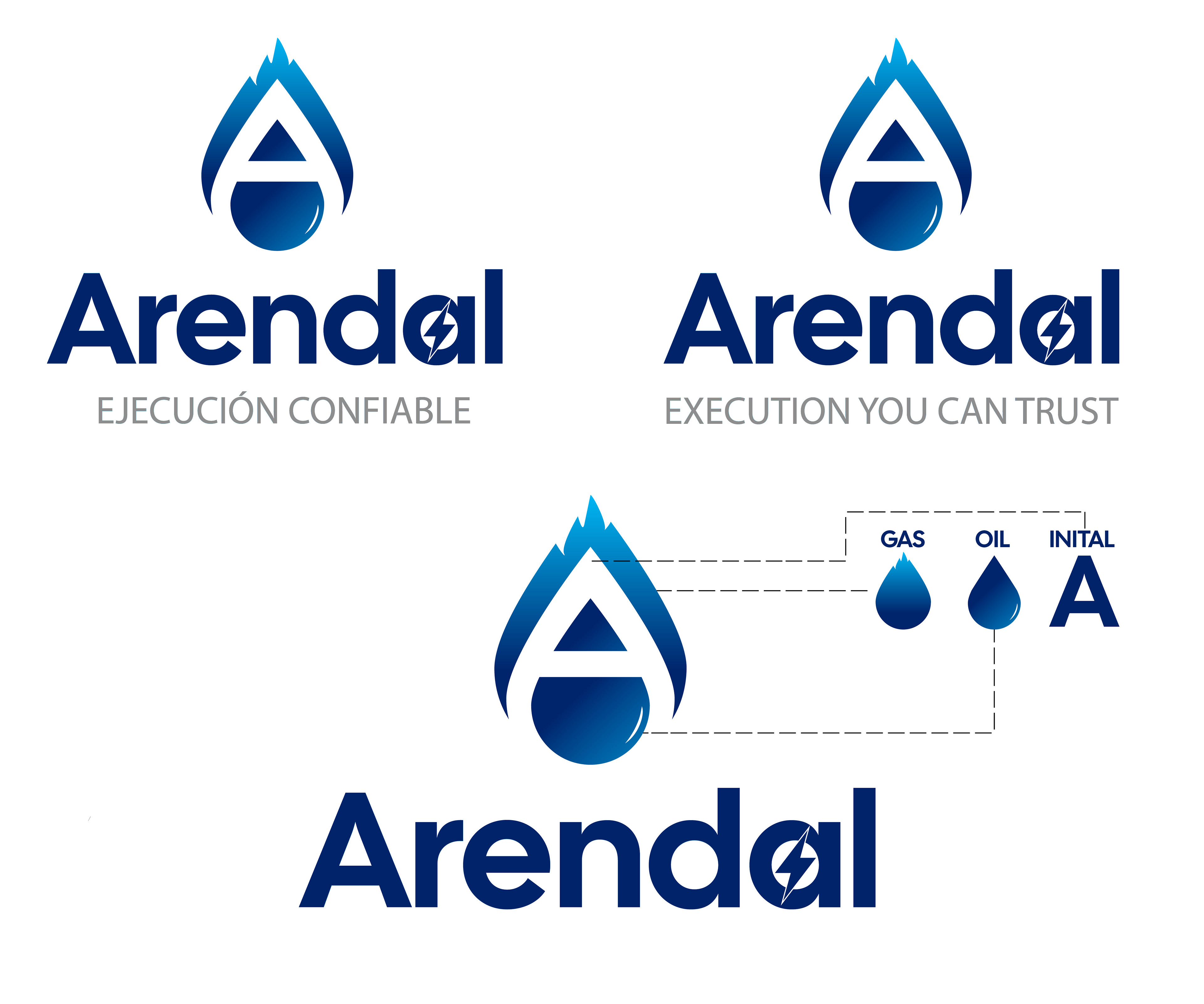


Our name is ARENDAL. We are an onshore and offshore construction company focused on the power and oil & gas industries. We work in 5 countries in Latin America plus the US. Our motto is: Execution you can trust (Ejecución Confiable in Spanish) We want our logo’s modernization that goes along with the original one or maintains a resemblance. We have had the same logo for the past 27 years. We like the dark blue-gray color. The original logo stands for an abstract “A’, and the center space of the “A” stands for a pipeline cross-section. We want to communicate reliability, strength, and flexibility. The name ARENDAL, and the text: Ejecución Confiable (in the Spanish version), and Execution you can Trust (in the english version) shall appear.